This was addressed by various interventions as part of the general redesign. Consistent and clear visual hierarchy of information was introduced, content was structured into logical groups, user interface was generally uncluttered by removing unnecessary and confusing elements, moving additional information under drills or introducing the dreaded concept of “more white space”.
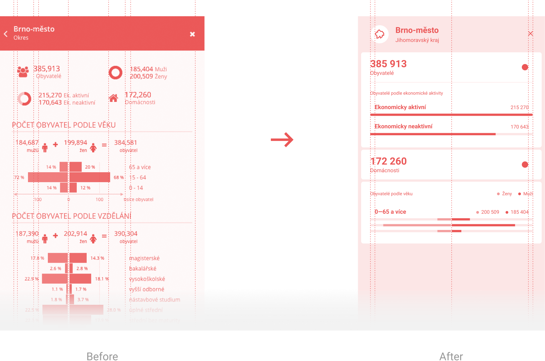
The introduction of headers to every panel state, clear labeling of every important element of the UI and unification of nomenclature cracked down on raging inconsistency and indicated to users where they are and what are they looking at. Entire knowledge base, step-by-step onboarding and tutorials were also built from scratch, providing users with emergency tools to better understand the platform.

Question mark tooltips available for every metric and every information block provided essential prompt explanation and linked to further information inside the knowledge base. In-app support with a dedicated team member was finally ready to answer anyone's questions pretty much real time. Simplification and diversification of demos showcased the variety of possible use cases in several different verticals. Demos also later served as ready-made templates, helping to close the gap between still quite complex creation of a project and non-technical users.
Dysfunctional search has been completely revamped allowing users to easily navigate not only through the map, but also through available data objects. Refining the search was now possible narrowing down the results in a common situation of thousands of data objects at hand.
Dysfunctional search has been completely revamped allowing users to easily navigate not only through the map, but also through available data objects. Refining the search was now possible narrowing down the results in a common situation of thousands of data objects at hand.
