The arbitrary approach with which the panel displayed large amounts of often seemingly unrelated information was completely thrown away.
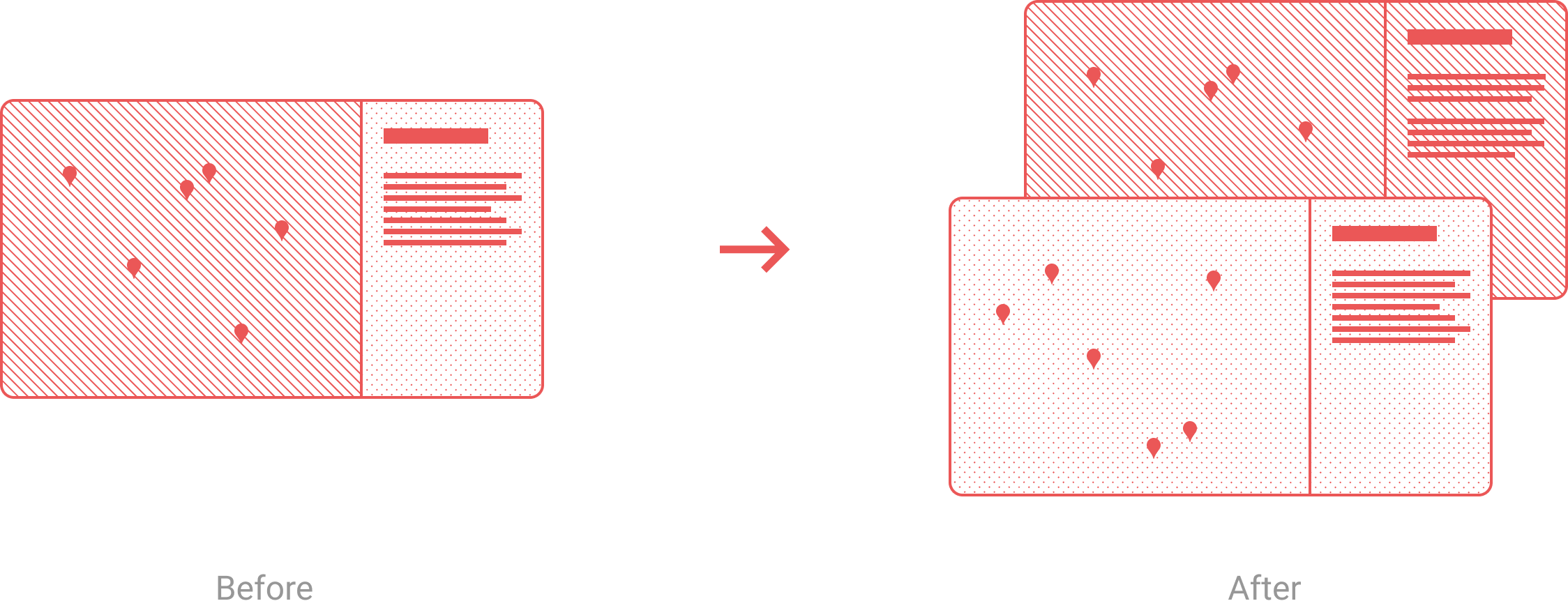
Many changes were made so that the panel was now showing only that information, that was directly connected to the metric currently being visualized in the map. While this reduced the possibility of displaying subjectively “related” and “useful” information next to each other, it was finally objectively unambiguous what is being displayed and made that information consistent. Sure, subjectivity was the next big design problem to solve, but it could now stand on a clear and objective default foundation.
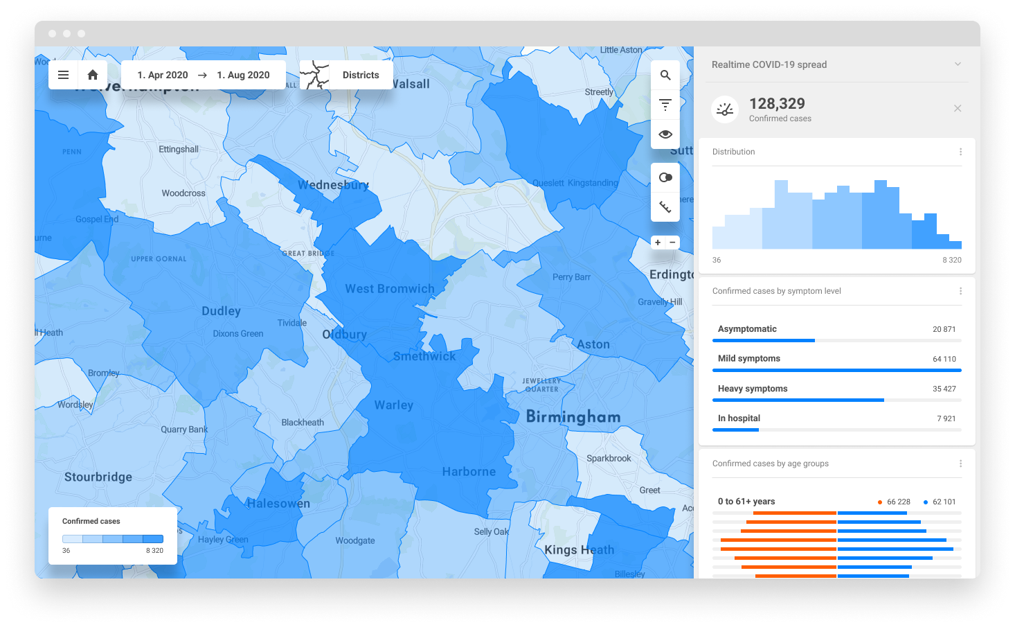

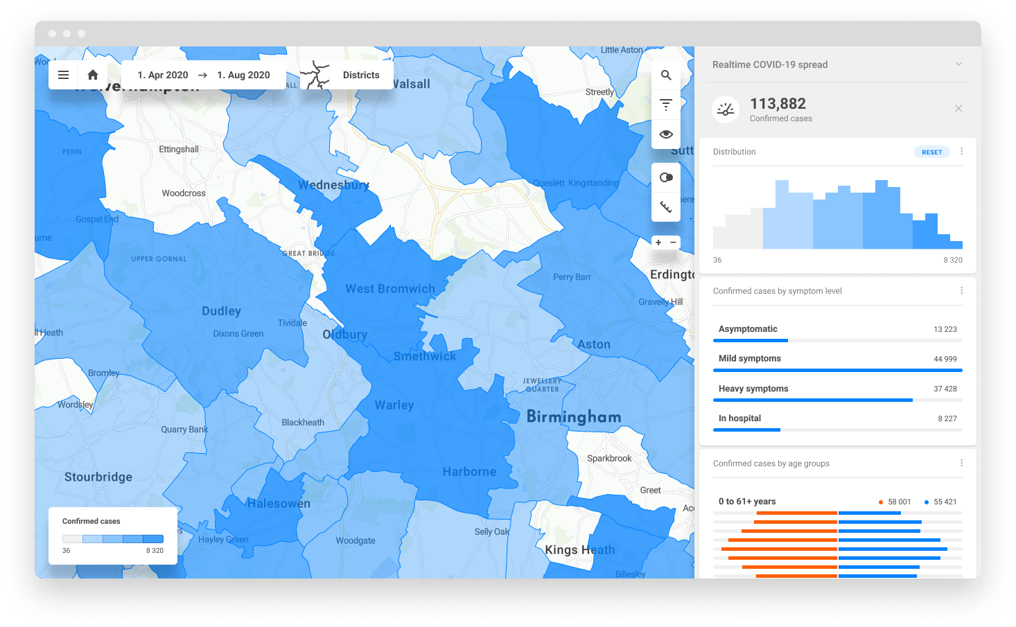

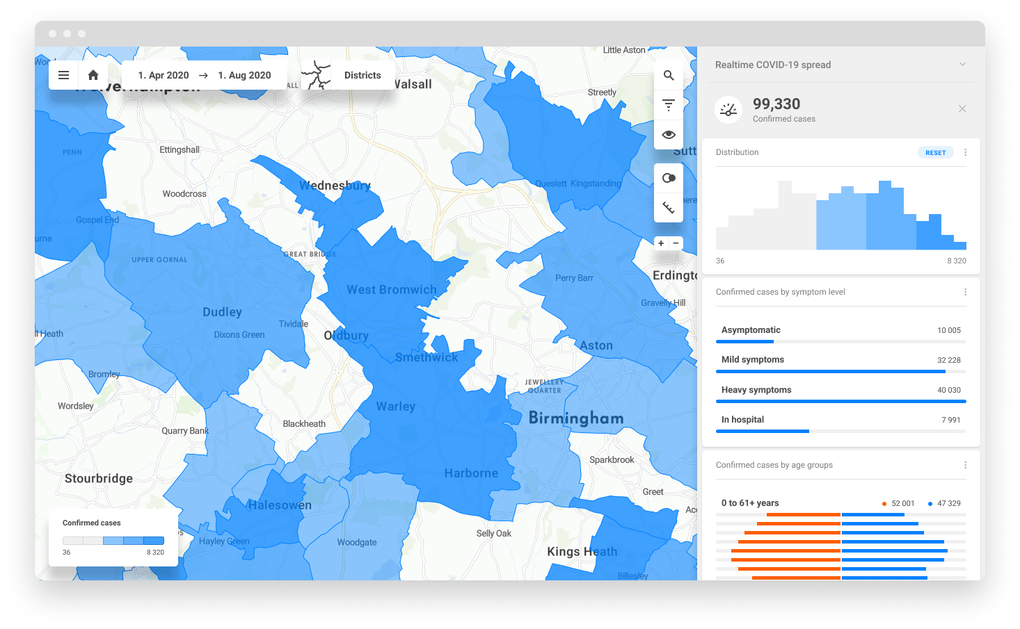
Great deal of development effort was devoted towards making sure that any element in the panel or any object in the map was fully interactive. This finally enabled any action in the panel to be directly followed by a logical reaction in the map, and vice versa.
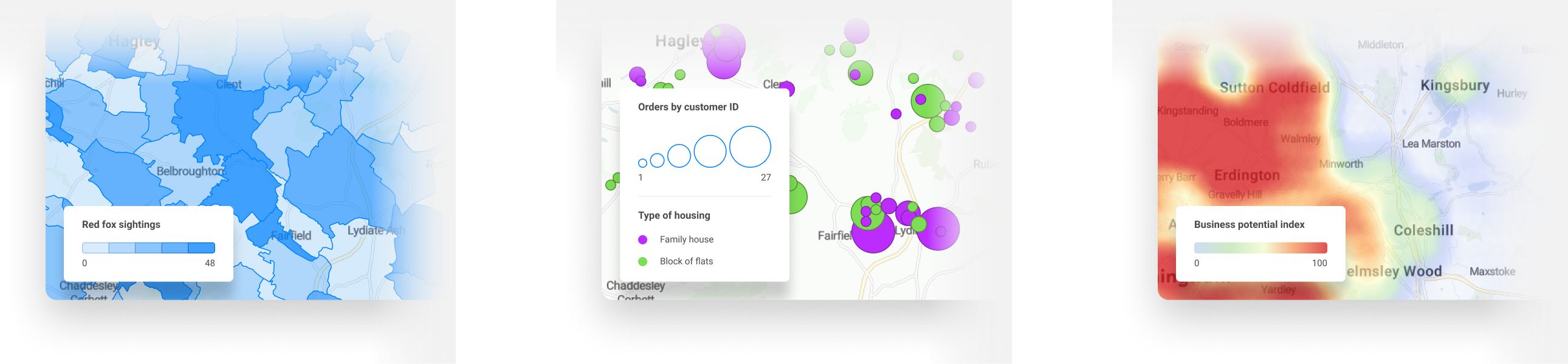
Addition of highly contextual and interactive legend dramatically improved the understanding of the map and careful cartographic redesign of the base map significantly improved legibility of visualisations.
Addition of highly contextual and interactive legend dramatically improved the understanding of the map and careful cartographic redesign of the base map significantly improved legibility of visualisations.