My proposal was this: every piece of information—if it is allowed by available data—has to be fully interactive. Although it meant a complete redo of the way data was handled, it was the only long-term way forward.

It was now possible to display any metric it the map, filter it across all available dimensions, calculate its value in accordance to current selection in the map, drill it to gain detailed knowledge about its structure and further tweak the visualization. This provided users with unprecedented flexibility of analysing their data and was a huge step towards a truly universal platform.
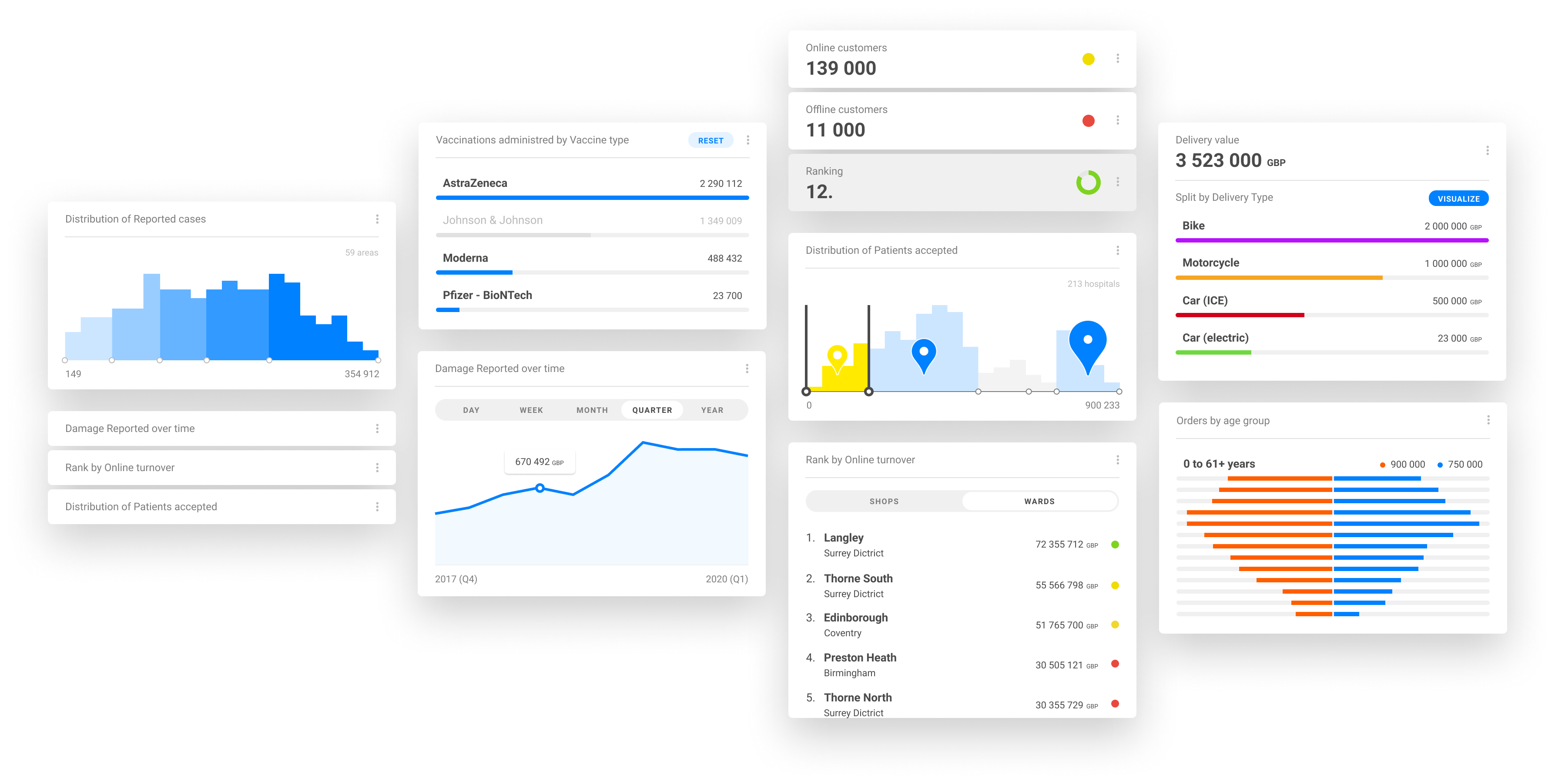
A visual concept of "Fitness" was introduced for each metric. This allowed users to quickly assess the overall state of certain object or group of objects using a simple but effective traffic light metaphor.

Brand new way of modular organisation of the panel was designed. This made the panel much more logical and legible, and all metrics clearly distinguishable from the rest of the content.
Concept of "information blocks" was introduced. Blocks like Distribution, Ranking, Categories, Time series etc. grouped specific information and interaction options on a single card. This not only made these controls unambiguously linked to a concrete metric, but these controls were now uniform and consistent across different metrics and use cases.
Concept of "information blocks" was introduced. Blocks like Distribution, Ranking, Categories, Time series etc. grouped specific information and interaction options on a single card. This not only made these controls unambiguously linked to a concrete metric, but these controls were now uniform and consistent across different metrics and use cases.